1. 개요
Flutter 의 대부분의 누를 수 있는 위젯은 InkWell animation 이 채택되었다. 위젯을 탭하면 위젯 색상이 highlight 되고 탭 위치부터 원이 splash 되어 퍼져나간다.
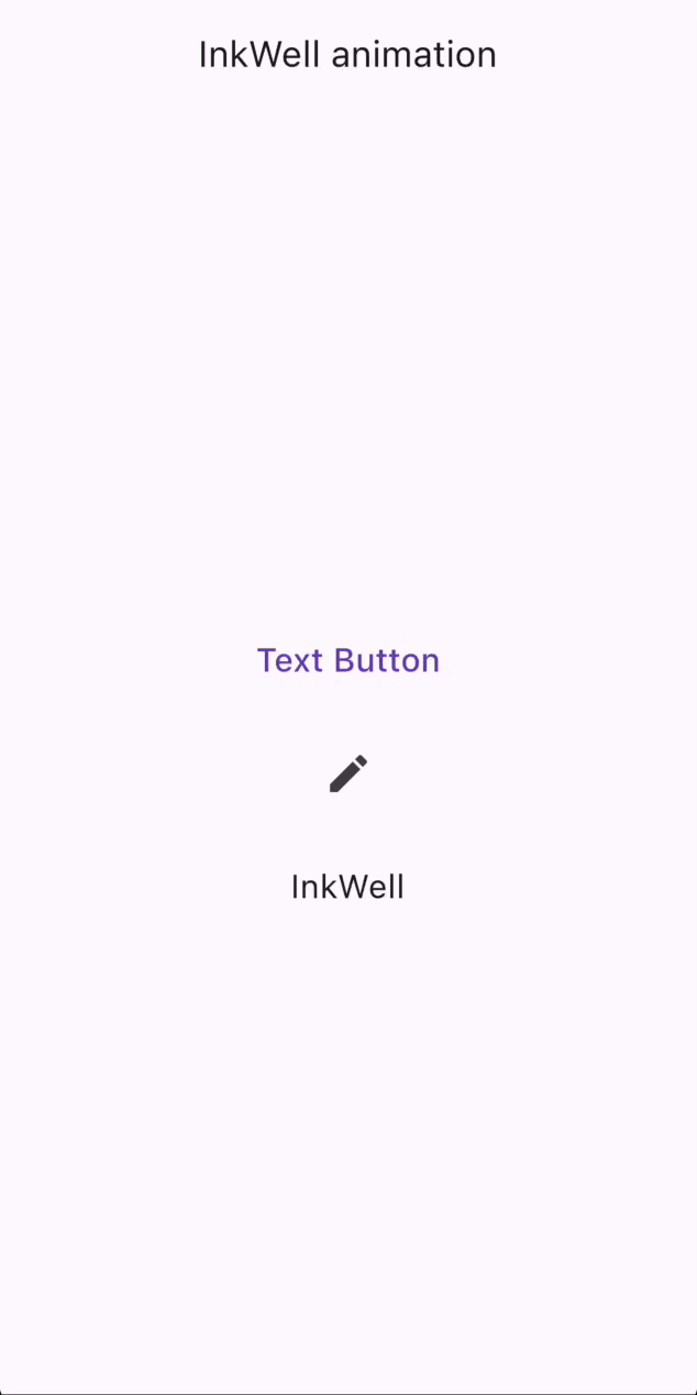
TextButton,IconButton,InkWell위젯의 예시
위 gif 의 코드는 아래와 같다.
import 'package:flutter/material.dart';

void main() => runApp(const MyApp());

class MyApp extends StatelessWidget {
  const MyApp({super.key});

  @override
  Widget build(BuildContext context) {
    return MaterialApp(
      debugShowCheckedModeBanner: false,
      title: 'Flutter Demo',
      theme: ThemeData(
        colorScheme: ColorScheme.fromSeed(seedColor: Colors.deepPurple),
        useMaterial3: true,
      ),
      home: const MyHomePage(),
    );
  }
}

class MyHomePage extends StatelessWidget {
  const MyHomePage({super.key});

  @override
  Widget build(BuildContext context) {
    return Scaffold(
      appBar: AppBar(title: const Text('InkWell animation')),
      body: Center(
        child: Column(
          mainAxisAlignment: MainAxisAlignment.center,
          children: [
            TextButton(
              onPressed: () {},
              child: const Text('Text Button', style: TextStyle(fontSize: 20.0)),
            ),
            const SizedBox(height: 20.0),
            IconButton(
              onPressed: () {},
              icon: const Icon(Icons.edit),
              iconSize: 30.0,
            ),
            const SizedBox(height: 20.0),
            InkWell(
              onTap: () {},
              child: Container(
                width: 200.0, height: 50.0,
                alignment: Alignment.center,
                child: const Text('InkWell', style: TextStyle(fontSize: 20.0)),
              ),
            ),
          ],
        ),
      ),
    );
  }
}
그렇다면, 토스(Toss) 의 위젯처럼 탭했을 때 위젯의 Scale 을 조절할 수는 없을까?
이러한 위젯을 만드는 것이 이번 포스팅의 주제이다.
2. 사용개념
2.1. mixin
Mixins are a way of defining code that can be reused in multiple class hierarchies.
Mixin 은 여러 클래스 계층에서 재사용할 수 있는 코드를 정의하는 방법이다. [출처: Dart 공식 문서]
지금부터 Pressable 이라는 Mixin 을 만들어 위젯에 적용해보고자 한다.
3. Pressable 구현
Pressable 이 적용될 위젯은 다음을 만족해야 한다.
TapDown시, 위젯의 크기가 작아진다.TapUp시, 위젯의 크기가 원상복귀되고 함수가 호출된다.TapCancel시, 위젯의 크기가 원상복귀된다.
GestureDetector 위젯을 활용하여 Pressable Mixin 을 구현하였다.
import 'package:flutter/material.dart';

mixin Pressable<T extends StatefulWidget> on State<T> {
  // GestureDetector 위젯의 함수형 매개변수
  Function(TapDownDetails)? _onTapDown;
  Function(TapUpDetails)? _onTapUp;
  VoidCallback? _onTapCancel;

  final Duration _duration = const Duration(milliseconds: 100);
  double _scale = 1.0;

  double get pressedScale => .95;

  // tapDown 시 scale 을 5% 작게 설정
  void _setOnTapDown() {
    _onTapDown = (_) => setState(() => _scale = pressedScale);
  }

  // tapUp 시 scale 을 원래 크기로 복구, onPressed 함수 호출
  void _setOnTapUp() {
    _onTapUp = (_) => setState(() {
      _scale = 1.0; onPressed();
    });
  }

  // tapCancel 시 scale 을 원래 크기로 복구
  void _setOnTapCancel() {
    _onTapCancel = () => setState(() => _scale = 1.0);
  }

  @override
  void initState() {
    super.initState();
    _setOnTapDown();
    _setOnTapUp();
    _setOnTapCancel();
  }

  // 추상 getter onPressed
  VoidCallback get onPressed;

  // build 메소드 내에 buildContent 를 GestureDetector 와 AnimatedScale 이 감싸도록 구현
  @override
  Widget build(BuildContext context) {
    return GestureDetector(
      onTapDown: _onTapDown,
      onTapUp: _onTapUp,
      onTapCancel: _onTapCancel,
      child: AnimatedScale(
        scale: _scale,
        duration: _duration,
        child: buildContent(context),
      ),
    );
  }

  // 추상 메소드 buildContent
  Widget buildContent(BuildContext context);
}
이렇게 만든 Mixin 은 다음과 같은 예시로 사용될 수 있다.
// statefulWidget 을 만들고
class PressableButton extends StatefulWidget {
  const PressableButton({
    super.key,
    required this.onPressed,
    required this.child,
  });

  final VoidCallback onPressed;
  final Widget child;

  @override
  State<PressableButton> createState() => _PressableButtonState();
}

// state 클래스에 만든 Mixin 을 with 하면 완성!
class _PressableButtonState extends State<PressableButton> with Pressable {
  @override
  VoidCallback get onPressed => widget.onPressed;

  @override
  Widget buildContent(BuildContext context) => widget.child;
}
커스텀 위젯 PressableButton 을 사용한 예시 코드와 실행 결과는 다음과 같다.
PressableButton(
  onPressed: () {},
  child: Container(
    width: 200.0, height: 50.0,
    alignment: Alignment.center,
    child: const Text('InkWell', style: TextStyle(fontSize: 20.0)),
  ),
),
하지만 뭔가 심심한 것 같다. 탭 되고 있는 것인지도 잘 안보인다.
토스 위젯처럼 탭 하면 축소되면서 음영이 표시되면 어떨까?
다음과 같이 바꿔보았다.
mixin Pressable<T extends StatefulWidget> on State<T> {
  // GestureDetector 위젯의 함수형 매개변수
  Function(TapDownDetails)? _onTapDown;
  Function(TapUpDetails)? _onTapUp;
  VoidCallback? _onTapCancel;

  final Duration _duration = const Duration(milliseconds: 100);
  // 크기 조정 값
  double _scale = 1.0;
  // 투명도 [New]
  double _opacity = .0;
  // 색상 [New]
  static const Color _tintColor = Colors.black;


  double get pressedScale => .95;
  double get pressedOpacity => .1;

  // tapDown 시 scale 을 5% 작게 설정
  // tintColor 의 투명도를 10% 로 설정 [New]
  void _setOnTapDown() {
    _onTapDown = (_) => setState(() {
      _scale = pressedScale;
      _opacity = pressedOpacity;
    });
  }


  // tapUp 시 scale 을 원래 크기로 복구, onPressed 함수 호출
  // tintColor 를 안 보이게 설정 [New]
  void _setOnTapUp() {
    _onTapUp = (_) => setState(() {
      _scale = 1.0;
      _opacity = .0;
      onPressed();
    });
  }

  // tapCancel 시 scale 을 원래 크기로 복구
  // tintColor 를 안 보이게 설정 [New]
  void _setOnTapCancel() {
    _onTapCancel = () => setState(() {
      _scale = 1.0;
      _opacity = .0;
    });
  }

  @override
  void initState() {
    super.initState();
    _setOnTapDown();
    _setOnTapUp();
    _setOnTapCancel();
  }

  // 추상 getter onPressed
  VoidCallback get onPressed;

  // build 메소드 내에 buildContent 를 GestureDetector 와 AnimatedScale 이 감싸도록 구현
  // AnimatedContainer 도 추가 [New]
  @override
  Widget build(BuildContext context) {
    return GestureDetector(
      onTapDown: _onTapDown,
      onTapUp: _onTapUp,
      onTapCancel: _onTapCancel,
      child: AnimatedScale(
        scale: _scale,
        duration: _duration,
        // AnimatedContainer 을 사용하여 위젯의 색상 투명도 조절 [New]
        child: AnimatedContainer(
          duration: _duration,
          decoration: BoxDecoration(
            color: _tintColor.withOpacity(_opacity),
            // 너무 각진 위젯의 꼭짓점을 둥글게 설정 [New]
            borderRadius: BorderRadius.circular(10.0),
          ),
          child: buildContent(context),
        ),
      ),
    );
  }

  // 추상 메소드 buildContent
  Widget buildContent(BuildContext context);
}
원하는 대로 됐다!
Button 뿐만 아니라, Card 나 ListTile 에도 커스텀하여 사용할 수 있을 것이다.
구체적인 색상이나, 축소 비율은 _tintColor, pressedOpacity, pressedScale 의 값을 조절하면 된다!!
'Develop > Flutter' 카테고리의 다른 글
| [Flutter] 한글 Utility 기능 (0) | 2025.01.28 |
|---|---|
| [Flutter] 문자열 명명 형식 변환기 (String Case Converter) (0) | 2024.11.29 |
| [Flutter] Duration 값 간결히 나타내기 (0) | 2023.11.01 |
| [Flutter] 순환 캐러셀 (Circular Carousel) 위젯 만들기 (0) | 2023.10.16 |


